
Why Custom Shirt Printing Uses Pantone Matching for Logos
When representing your business or organization, every detail matters. If you need 50 shirts for a company picnic by Friday and your online design tool crashes, we understand the frustration. Your visual brand identity serves as the foundation of your professional reputation. If your logo color looks different on a hat than it does on a hoodie, people notice. At our print shop in Commack, Long Island, we prioritize consistency to ensure your brand shines.
The Science of Color Fidelity in Custom Apparel
Achieving perfect color reproduction requires understanding how light and pigment interact. When ordering custom apparel, you expect the final product to mirror your digital mockup. We use high-quality inks that stay vibrant through many wash cycles. Our team treats every order as a critical project because your image depends on it. We bridge the gap between creative design and the reality of textile printing daily.
Why Your Brand Identity Depends on Consistent Ink Colors
Your brand colors act as silent ambassadors for your mission and values. When customers see your logo, they should instantly recognize it regardless of the garment type. Using Pantone matching for apparel logos ensures that your official brand colors remain standard across every piece of promotional gear. This consistency builds trust with your audience and solidifies your market presence. Without strict adherence to color codes, your brand can appear unprofessional or disconnected across different products.
Uniformity creates a cohesive look for team shirts or company uniforms. Whether you order custom polo shirts for a trade show or hoodies for staff, the ink should look identical. We carefully manage our ink mixing processes to prevent shifting hues during production runs. Your company apparel serves as a walking advertisement, and quality represents your commitment to excellence. We ensure every print run meets your specific branding requirements.
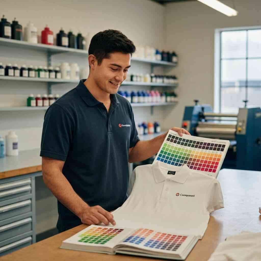
Understanding the Pantone Matching System as a Universal Language
The Pantone Matching System acts as the gold standard for designers and printers worldwide. It provides a specific number for every possible shade, eliminating the guesswork of color names like “navy blue” or “bright red.” By utilizing this system, we ensure that the color you see on your screen matches the ink on our press. This universal language prevents errors during the production phase of your custom tees. It is the most reliable way to communicate color intent in the printing industry.
Our shop in Suffolk County relies on these standardized codes to keep your branding sharp and identifiable. When you request a specific Pantone shade, we mix our inks to match that exact formula. This process removes the subjectivity that often leads to disappointing print results at inferior shops. Because we value precision, we treat these color codes as absolute requirements for your order. Your logo deserves the accuracy that only the Pantone system provides.
How We Achieve Precise Logo Shirt Design Accuracy
Our design process begins with a detailed review of your submitted artwork. We evaluate your logo to determine if the colors are optimized for our printing methods, such as screen printing or digital printing. Sometimes, we recommend vector art conversion to ensure that your logo scales perfectly without losing clarity. Our team provides professional logo reproduction on shirts by preparing your files with the right color profiles. We never take shortcuts regarding the technical setup of your designs.
We also offer a free mockup so you can see how your logo will look before we start production. This allows us to confirm that the colors and placement meet your expectations. We focus on small details, such as underbase printing, to make sure colors pop on dark fabrics. Our goal is to ensure your custom apparel reflects your vision in every way. From high-quality custom shirts to hats, we maintain a rigorous standard of design excellence.
Technical Mastery Behind Our Screen Printing Color Accuracy
Mastering the mechanics of the press is vital for achieving professional results. Our shop features high-performance equipment like M&R Gauntlet presses that handle large orders with speed and accuracy. We combine this hardware with decades of experience to master the flow and opacity of our inks. You can trust that your business shirts will feature crisp, accurate colors every time. We are proud to serve Commack and the surrounding areas with this level of technical proficiency.
The Role of Spectrophotometer Calibration in Apparel Decoration
Calibration is the silent hero of the printing world. We use advanced spectrophotometers to measure ink samples, ensuring they match your specific Pantone requests. These devices quantify color mathematically, removing human error from the mixing equation. By maintaining precise calibration, we ensure that your brand stays consistent from the first shirt to the last in a bulk order. It is an essential step in our professional color management for shirts.
Using a spectrophotometer allows us to maintain strict quality control throughout the printing process. We check our ink batches against digital standards before loading them into the press. This rigorous approach prevents the color drift that often plagues lesser printing operations. You deserve a partner that cares about the technical side of branding as much as you do. Our dedication to measurement results in superior apparel that you will be proud to distribute.
Managing Screen Mesh Counts for Optimal Spot Color Printing
The mesh count of our screens dictates how much ink lands on the fabric. A lower mesh count, such as 110, allows for a thick deposit of white ink, which is perfect for an underbase. For detailed logos with fine lines, we switch to higher mesh counts to keep the image sharp. Selecting the right mesh is part of our spot color printing for corporate apparel strategy. This technical choice directly impacts how vibrant your colors appear on the final garment.
We tailor our screen setup to your specific logo design and fabric type. For instance, a light, thin ink deposit might look best on a premium tee, while heavy ink is better for workwear. Our team understands these nuances and adjusts the screens accordingly for every single project. We refuse to use a one-size-fits-all approach because every brand is unique. Precision in mesh selection ensures that your logo looks crisp and clean every time.
Achieving Consistent Brand Messaging Through Professional Ink Formulation
Our inks are formulated to meet the highest safety and durability standards. We use OEKO-TEX certified water-based inks that are safe for all ages and incredibly soft to the touch. These precise ink color mixing for textiles techniques ensure your garments feel premium. We also maintain records of your specific color formulas for future reorders. This means if you need more items for your team or event later, they will match your original order perfectly.
Formulation is an art that requires both chemistry and intuition. We mix our colors carefully to ensure the opacity and brightness match your brand standards. Our focus on quality extends beyond the ink to the final curing process on our conveyor dryers. This ensures the design is wash-fast and durable for long-term wear. We want your custom gear to be a long-lasting part of your professional wardrobe.
Bridging the Gap Between Digital Files and Textile Reality
Designers often create logos on screens that glow, but textiles absorb light differently. We understand that your digital file is a reference, not an identical match for printed ink. Our team educates clients on how to adjust expectations for different substrates, such as cotton or polyester. By managing this transition, we help you achieve the best possible result for your brand. We take the stress out of the printing process by handling the technical conversions for you.
Converting Vector Art for High Quality Custom Shirts
Vector art is the foundation of high-quality printing because it remains crisp at any size. If you only have a raster image, we offer logo vector conversion for screen printing to prepare your file for the press. This process creates clean paths for our machines to follow, ensuring your lines are sharp and colors are separated correctly. We never print directly from low-resolution files because the results would be blurry. Your logo is the face of your company, and it deserves to be reproduced with complete clarity.
Our design team is highly skilled at recreating logos that may have lost quality over time. We respect the original integrity of your design while optimizing it for garment printing. This includes separating colors into individual screens for a clean, professional finish. You will receive a high-quality product that captures your original vision perfectly. Let us handle the technical file preparation so you can focus on building your brand.
Overcoming Limitations in the Screen Printing Color Gamut
Sometimes, a specific brand color might fall outside the range of what standard screen printing inks can achieve. When this happens, we work with you to find the closest possible Pantone match that looks great on fabric. We can also suggest specialty inks, like metallics or high-density, to add depth to your design. Understanding the color fidelity and printing methods is how we solve complex design problems. We are honest about what works best on different colors of fabric.
We guide you through the process of choosing colors that will look vibrant against your chosen garment shade. Dark fabrics often require a layer of white ink first, which we account for in our setup. This layer acts as a canvas, allowing your logo colors to shine through without getting muddied. Our team has the experience to anticipate these challenges and fix them before printing begins. Your satisfaction is our primary goal.
Why Professional Color Management Matters for Corporate Branding Standards
Corporate brands rely on recognition to thrive, and color is the biggest factor in that equation. If your employees show up to a trade show with mismatched colors, it reflects poorly on your company. We help you maintain consistent brand messaging for custom merchandise by keeping your color palette stable across all items. From polo shirts to custom hats, we ensure your brand identity remains protected. You should never have to worry about whether your logo looks right on your gear.
Our print shop acts as an extension of your own marketing team. We understand that your promotional apparel needs to align with your overall strategy. We offer reliable, high-quality printing that meets the strict guidelines of large organizations. By partnering with us, you gain access to a team that truly cares about your brand’s reputation. We treat every order as a chance to help you grow.
Ensuring Your Custom Apparel Reflects Your Vision
Your vision is the start of everything we do in our Commack shop. Whether you are printing shirts for a family reunion or uniforms for a local construction business, we handle it with care. We use custom apparel branding solutions to turn your simple ideas into professional products. Our goal is to help you create something that your audience will actually want to wear. Every project is a unique opportunity to build something great together.
Strategies for Maintaining Brand Color Consistency Across Bulk Orders
Ordering in bulk can lead to variation if the print shop is not diligent. We combat this by utilizing a standardized system that tracks your specific ink formulas for every job. We perform test prints on every order to verify that the color matches the target Pantone swatch before we hit full production. This simple, effective step protects your brand from inconsistency in large runs. Our commitment to industry standard color palettes for shirts means you always know what to expect.
We also keep your design files on hand for quick and accurate reordering. If you need to print a few more shirts later, we pull your original job files and ink recipes to ensure an exact match. This makes the replenishment process easy and stress-free for your business. We believe that building a long-term partnership requires this kind of reliable attention to detail. Your growth is our success.
The Impact of Industry Standard Color Palettes on Promotional Giveaways
Promotional giveaways are a powerful way to get your name out there, but only if they look great. If a customer receives a branded tote bag or a custom hoodie with a faded or off-color logo, they are unlikely to wear it. We use high-quality inks to ensure your gear looks like a premium gift rather than a cheap item. This improves the ROI of your marketing spend by making your products desirable. People love wearing well-designed gear that looks like it came from a top-tier brand.
We encourage you to think about the long-term impact of your custom items. Using the right color profile makes your logo pop and creates a positive impression of your company. Whether you are ordering a hundred shirts or a thousand tote bags, we treat the job with the same high standards. You deserve products that make your brand stand out from the crowd. Our team is here to help you make that happen.
Connecting With Your Audience Through Reliable Custom Printing Techniques
Custom apparel is about connection. When your team wears a uniform, they feel like part of something bigger. When your customers receive a gift, they feel valued by your company. We provide the reliable printing services that make these connections possible. By using precise Screen printing color accuracy in Commack, we ensure that your message is clear and professional. You can trust our team to deliver on time and within your budget.
If you are ready to get started, our website is full of tools to help you design your own shirt or upload your artwork. We offer fast turnarounds and no minimums on many items, making it easy for you to try new things. Our staff in our Commack print shop is always happy to answer questions about ink types, mesh counts, or embroidery. Let’s work together to make your next project a success. Contact us today to learn how we can bring your vision to life.
Frequently Asked Questions
Question: Why is using the Pantone Matching System essential for maintaining brand color consistency on my custom logo apparel?
Answer: The Pantone Matching System provides a universal language for color, ensuring that the specific shade you select is precisely what ends up on your garments. Without this system, color names like navy blue can be interpreted differently by different machines, leading to inconsistencies. By using Pantone color codes for apparel, we eliminate guesswork and ensure your visual brand identity remains unified across all products, from custom hoodies to promotional giveaways, reinforcing professional corporate branding standards.
Question: How does the article Why Custom Shirt Printings Uses Pantone Matching for Logos explain the technical process behind your professional color matching?
Answer: The article highlights our commitment to color fidelity in screen printing by detailing the use of advanced equipment like spectrophotometers. These devices allow for precise ink color mixing, removing human error and ensuring every batch matches your requested Pantone shade. By combining this technology with expert knowledge of screen mesh counts and underbase printing, we ensure that your logo shirt design is reproduced with absolute accuracy on any fabric type.
Question: Can you ensure that my custom business shirts will look identical if I need to reorder them in the future?
Answer: Yes, absolutely. We prioritize consistent brand messaging by maintaining detailed records of your specific ink formulas and Pantone codes. When you order from us, we store your design files and color profiles securely. This rigorous approach to industry standard color palettes ensures that whether you order today or a year from now, your promotional apparel will maintain the same high-quality appearance, keeping your corporate image looking sharp and professional.
Question: Why do you suggest vector art conversion for my logo when ordering high-quality custom apparel?
Answer: Vector art is critical for achieving the best results in screen printing color accuracy. Unlike raster images that can become blurry when resized, vector files provide clean paths that allow our machines to apply ink with maximum precision. We offer professional logo reproduction services to convert your files into the correct format, ensuring your brand identity is displayed with the crispness and clarity expected from a leading custom apparel company.
Question: What steps does your team in Commack take to ensure that ink colors appear vibrant on dark fabrics?
Answer: To maintain high-quality custom apparel standards, we utilize specific techniques like underbase printing on dark garments. By applying a base layer of white ink, we create a bright, neutral canvas that allows your official brand colors to pop without being dulled by the fabric color. Our mastery of ink color mixing and screen printing color management techniques ensures that your branded merchandise quality remains consistent, regardless of the garment color or material.